how we got busy moms to use A health app
Kinsa Generative Research + Groups Feature Prototyping
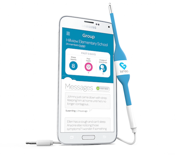
Kinsa's Group Feature
Kinsa is a VC-backed smart thermometer on a mission to track and prevent illness. They created a new in-app feature, Groups for a special sub-group of people on top of normal Kinsa users. Groups users were part of a nation-wide school partnership program where Kinsa had donated thermometers to families. Groups was meant to be a place for school communities to join together and keep one another healthy. However, Kinsa's Daily Active User Metrics revealed just one teensy problem:
NO ONE USED GROUPS.
... That's when our design team came to the rescue! Yay!
My Role
Conducted 1:1 In-Home Contextual Interviews, Data synthesis, Validated Personas, Design Sprint w/ Kinsa Team, Low & High-fidelity Prototyping, Presented Final Recommendations to Client
How Can We Increase User Engagement of Groups?
Our user testing revealed this meant answering 2 KEY QUESTIONS:
How can we increase the value of the content of the Healthcard?
How can we increase user engagement and conversation quality of the Message Board?
Results
Validation Results
Now that you know where we're headed, let's deep-dive into my design process...
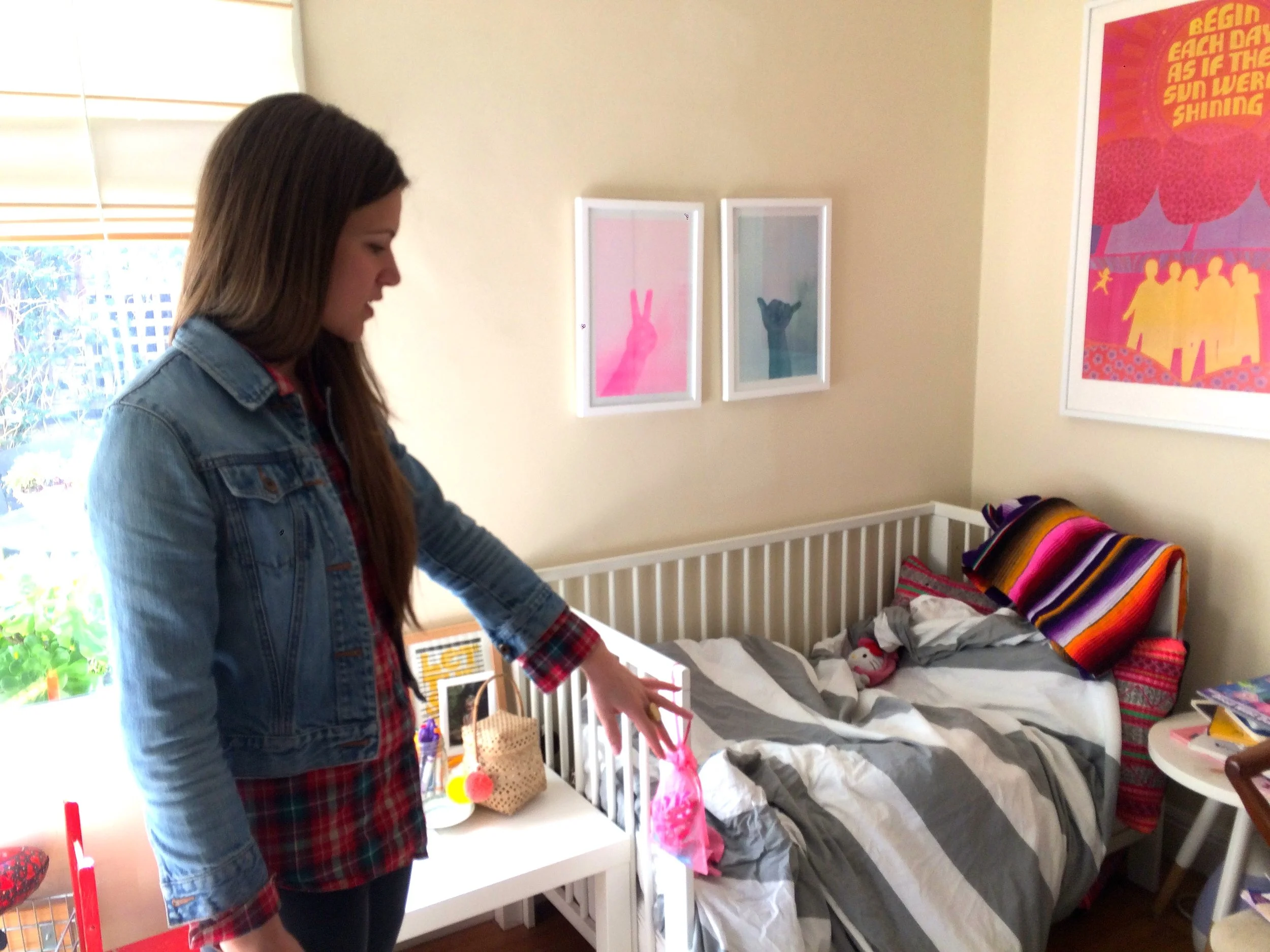
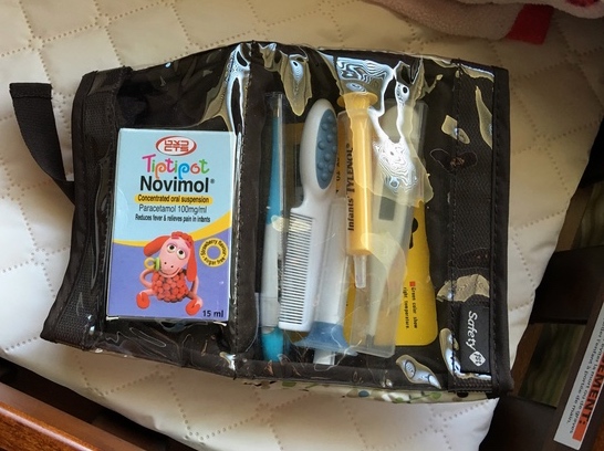
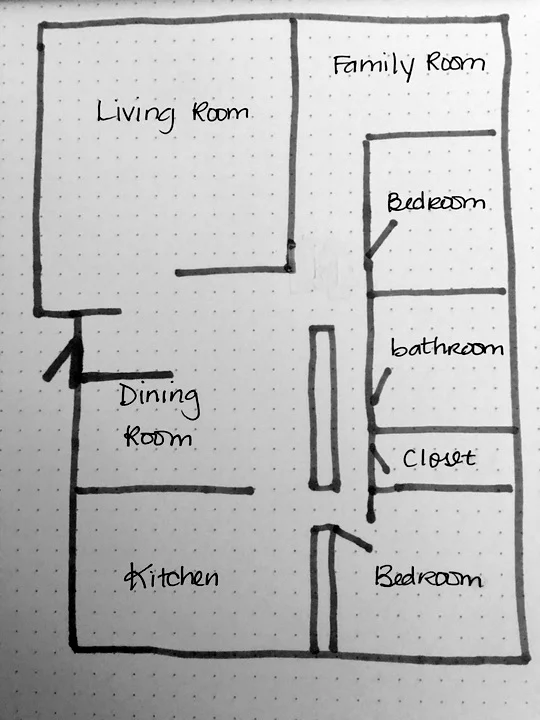
Getting Inside User's Heads... (and their cabinets)
Moms generously let us into their homes, around their children, and inside their private thoughts to understand their attitudes, thoughts and behaviors when caring for their sick child. Our team interviewed 23 users across 4 segments of both new & existing mom users and Coordinators of Kinsa's school program. We asked about their home habits, relationships with their children, health, technology, and their social groups, all while being careful to respect their privacy and the sensitivity of the subject matter.
It was enlightening to understand the complex host of thoughts and emotions that new moms feel:
"My only concern is for what others in the community see - that's the part I'm not comfortable with."
"I don't know how that works. I would just email the nurse."
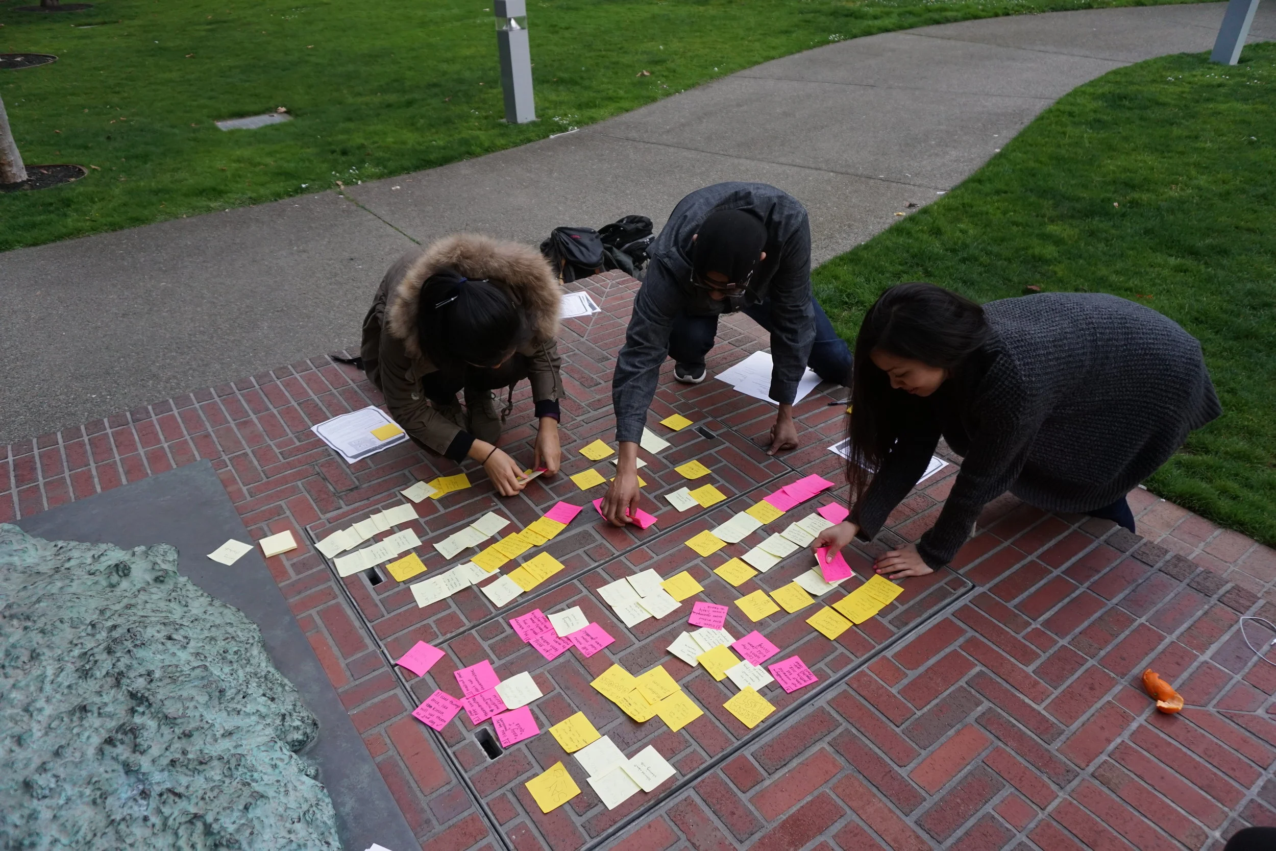
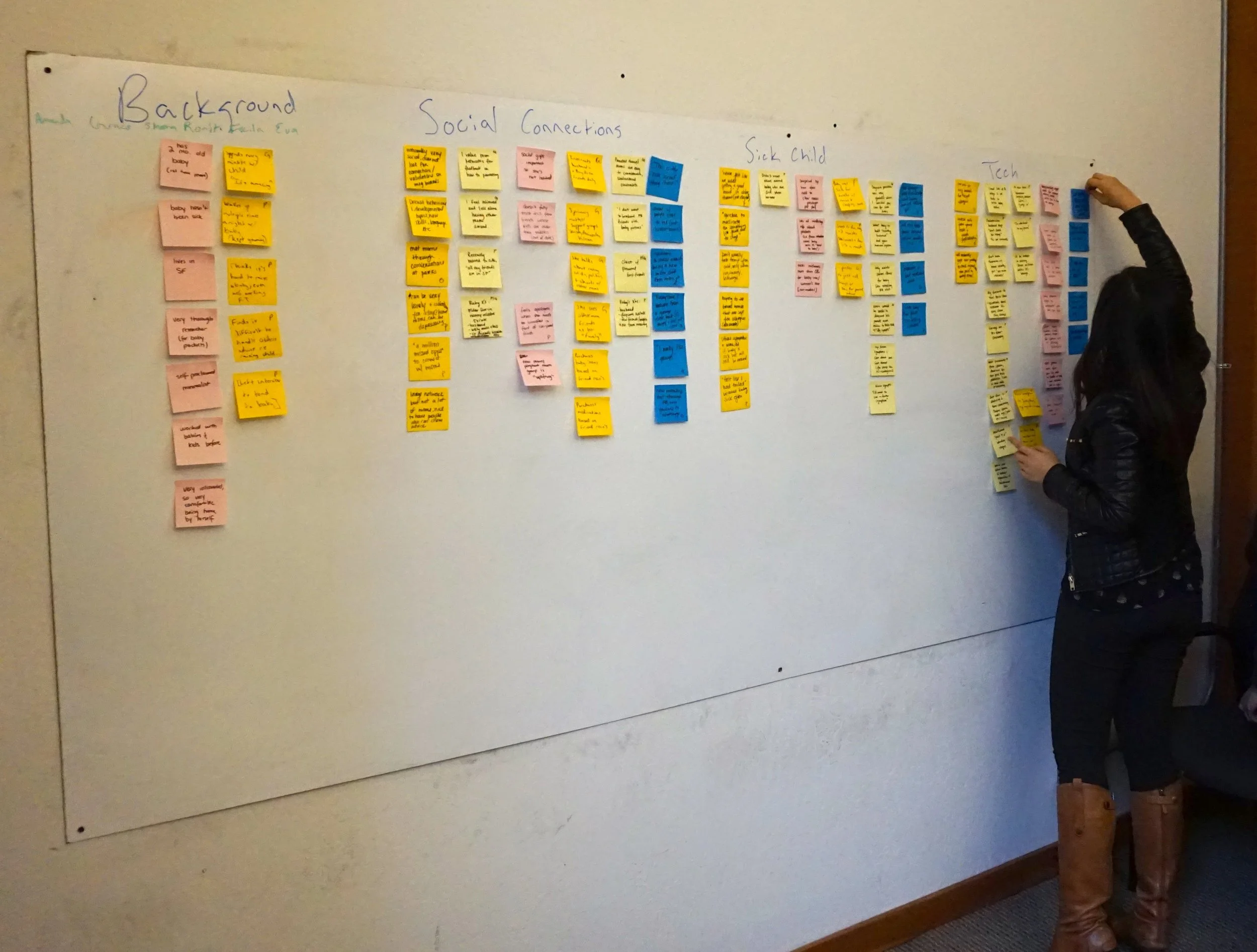
TOOOO MUCH data... Cannot Compute...
To make sense of it all, we consolidated the 23+ hours of interviews into a spreadsheet and conducted card sorting exercises to find patterns.
2. Affinity Mapping - to form connections & organize recurring themes
1. Empathy Mapping - to tap into what users said, felt, thought, did, and their problems & goals to get at deep motivations
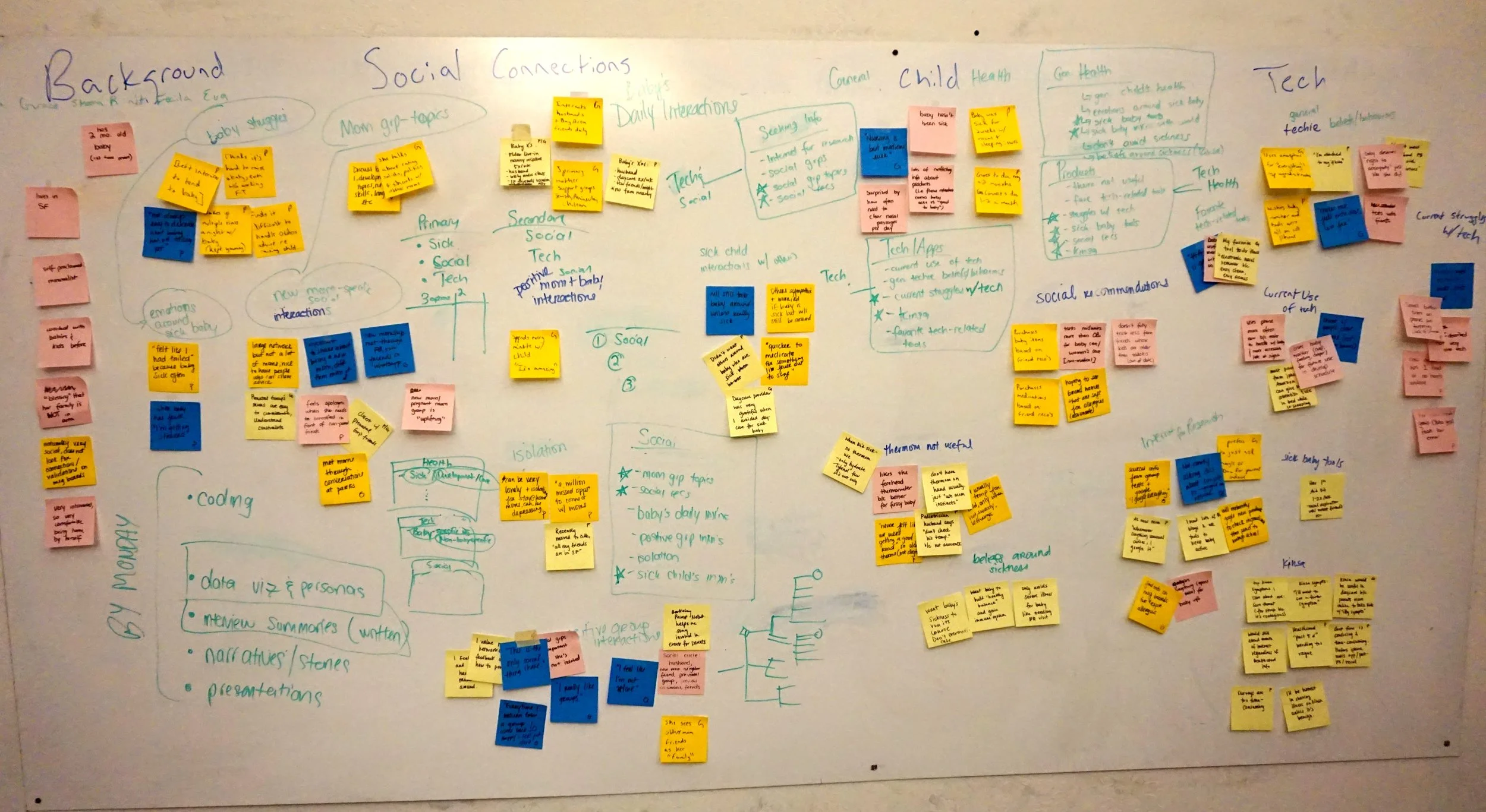
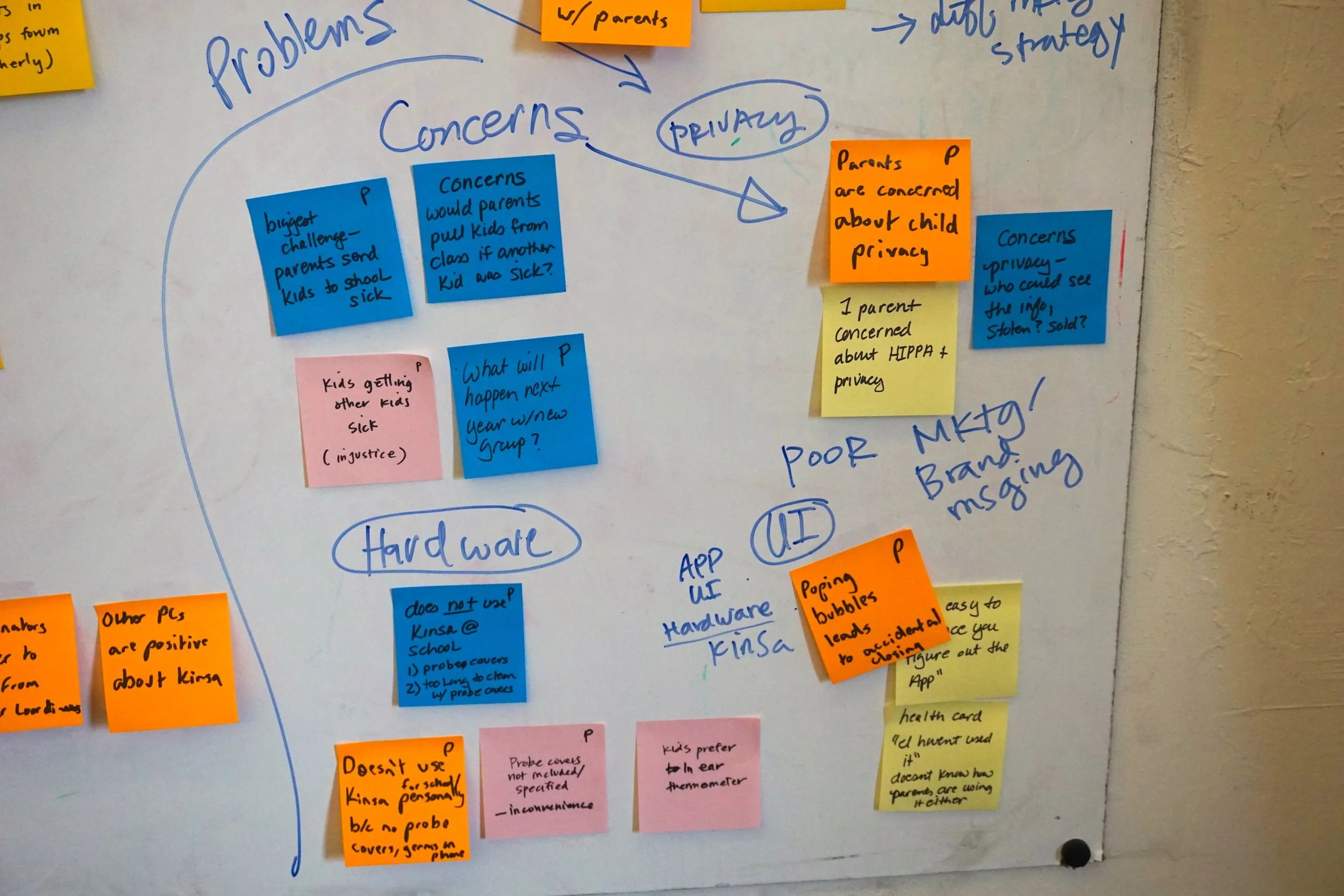
We Got 99 Problems, but here's the top 3...
Low Comprehension & Awareness
Moms didn't understand the value of the Health Card because they had trouble digesting the Information quickly and extrapolating how it was relevant to them. Moms were also unaware of how Groups features worked. Some moms didn't even know Groups existed!
"It doesn't feel automatically relevant."
Privacy Concerns
All moms had privacy concerns and were not aware they could post messages anonymously. They also worried about how Kinsa would share their child's illness information.
“Privacy is a concern, that’s why people are being more generic.”
Lack of Support
Moms want social support and sense of community, but the message board is not conducive to dialogue and the empty state can be intimidating.
“Most of the conversation is not back and forth. It’s just, ‘My kid came home today with a fever."
Next, we broke down each piece of the problem to form a design strategy ...
The 4-Pronged Attack
1.
Relevant & Scannable Content
... to increase comprehension & perceived value of Groups.
2.
Timely Groups Onboarding
... to raise awareness and clarify how Groups features work.
3.
Instill Confidence
... with reassuring copy that clarifies Kinsa's privacy policy and the anonymous posting function.
4.
Enable Dialogue
... with a more conversational and familiar Message Board model.
Priorities - Don't Forget the User!
To stay focused on the most important user goals, we validated our personas for reference throughout the design process. This helped us see that everyone except the New Moms shared needs that were within the scope of the Groups feature. After consulting with Kinsa, we decided to focus our designs on the remaining segments. (Our research on New Moms will be used by Kinsa to explore future development opportunities.)
There Are No Bad Ideas Right?
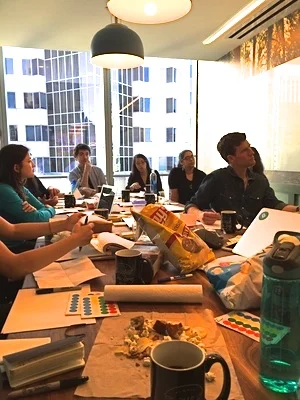
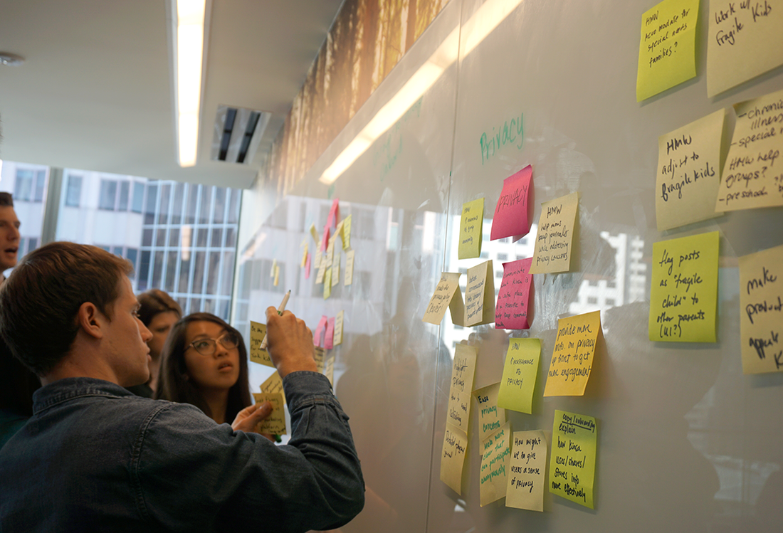
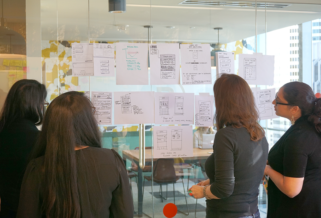
Now that we'd identified the target users and defined the problem, we were ready to kick off ideation! We ran a Google-Ventures-inspired design sprint with Kinsa stakeholders to share our insights & create initial prototypes.
Lightning Talks - unpack all info. on users, product, features & Kinsa
HMW's + Affinity Mapping - decide on which problems to solve
Crazy 8's - Rapid sketching solutions
Zen Voting - Silent voting on top ideas to pursue
3 Testing Rounds = Lots of Learnings!
We tested many iterations of the Health Card, Community Board, and Onboarding Flow. 1 Usability Round and 2 Validation Rounds later, we had learned A LOT about what moms wanted. These insights informed our final design recommendations:
Health Card Prototypes
We tested what types of content was most useful + relevant:
Insights:
No graphs! - Moms don’t want to analyze data. Reduce cognitive load by interpreting the data for them.
Care Coordination Functionality with the child's school are most useful.
Don't just raise awareness around illness, moms want to know what actions to take to help treat/prevent illness.
Relevant = info. that provides exposure risk, *contagion level, severity info.
*Moms especially want a contagiousness indicator, which increases urgency to check the app.
Final Health Card Design
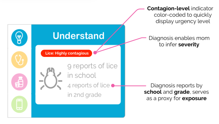
1. Surface the most RELEVANT information
2. Then, empower moms to ACTION
Community Board Prototypes
We tested various messaging elements and configurations to enable dialogue + increase relevance + address privacy:
Insights:
Posting behavior is driven by the need for social support, empathy & community, so design to induce conversation & build the community.
Parents want updates on post outcomes to use as examples of how others handle care, felt parental duty & investment in others' story.
Tags are useful for increasing scannability of messages for relevance.
Moms found Filtering by Grade, Symptom and Diagnosis to all be helpful.
Final Community Board Design
Moms vary on when & if they post anonymously, so provide options:
Parents want updates on post outcomes to use as examples of how others handle care, so prompt for updates:
Final Takeaways
Privacy is a paramount consideration when designing for health mobile apps.
Being a mom is a stressful job. Technology that helps them rally community support, especially in care coordination, is valuable.
Measuring a longitudinal metric like engagement can run counter to the rapidly iterative design process. This time-constrained project was no exception. Testing highly correlated metrics like intimacy and advocacy can provide valuable immediate feedback to guide our design decisions.
Client Testimonial
"The insights from their user research and design sprint delivered valuable impact by helping us test and prioritize important feature development. The team did a great job partnering cross-functionally with Kinsa throughout the entire project."
- Joey Cordes, UX Designer at Kinsa