Each analysis type has a “home” view where report-level controls (like adding a report to the dashboard) live.
What are Mixpanel Dashboards?
Mixpanel is a self-serve product analytics solution that lets teams easily analyze user behavior in real-time, across devices. The suite is made of 1 dashboard + 7 analysis report types, each with their “home” view. The dashboard is where users can view any combination of tags associated with a report.
The Problem
Dashboards are central to an analytics workflow and serves as an important first impression as the launching point for analysis. For new customers, a dashboard is also the quickest path to value since it’s essentially a summary view of all the ways in which Mixpanel can help you answer your question. Most tools make their dashboards the landing page or integrate dashboards into an onboarding experience. Yet new and returning Mixpanel users confusingly land on an untitled segmentation report because dashboards has such high product debt and low engagement.
Our Goal:
Create a dashboard experience that helps customers more easily understand their business metrics so they can make better business decisions.
Process
Discovery - Identify users, goals (gap data, stakeholder interviews, define personas)
Define scope (define & prioritize user stories)
Usability Testing, pain point synthesis
Design - Competitive & market research, design, gather feedback & iterate
Results & Takeaways - Success metrics, feedback, learnings, future work
Project Details
Role: Lead/Solo Designer - research, UI design
Environment: Desktop web. (Mobile case study coming soon.)
Team: 1 PM, 4 engineers, 1 Designer
Step 1) Discovery: Identify Users & Goals
I looked at gap data and conducted stakeholder interviews to identify 3 dashboard personas.
Step 2) Define Scope
We focused on the Content Creator persona based on our hypothesis that this would drive the highest engagement.
Step 3) Identify Pain Points
Summary of Pain Points
WORKFLOW: Roundabout and incomplete workflows make dashboards frustrating and confusing to use.
CONTROL: No easy way to control dashboard layout. Auto-sort, pre-selected dashboards creates confusion and complicates the flow. No way to filter data.
INTERFACE: Hidden CTA’s, unclear messaging, and system-created tags clutters the UI, making it hard to understand what’s on the page. Lack of organization and context makes the dashboard lists hard to navigate.
MENTAL MODEL: Tagging system doesn’t fit the mental model for how users view & analyze dashboards.
FLEXIBILITY: Lack of customization from the dashboard inhibits users from optimizing each dashboard for their needs.
Detailed Pain Points by Problem Area
Creating Dashboards from the dashboard view
No dashboard entry point
10 step flow!
Creating/Editing Dashboards from the report view
Auto-tags confusing, roundabout flow, lack of control
Hidden creation
Unclear messaging
Hard to find the right dashboards, Cluttered UI
Dead end / incomplete flow

Viewing & Analyzing Dashboards
Tags / defaults unnecessarily complicate the flow
Doesn’t fit user’s mental models
Encourages users down wrong path
No control
No customization
No flexibility
Step 4) Market Research, Design & Iterate
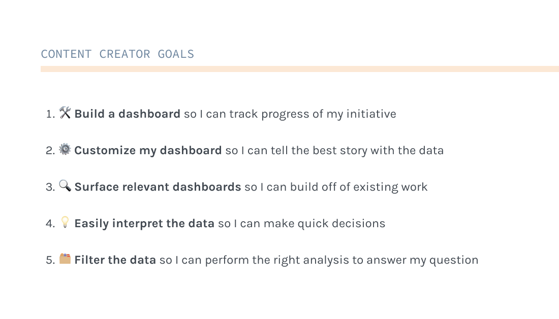
Solutions
My design solutions are outlined according to our 5 user goals. Some goals are further broken down into their sub-parts. Here’s a recap of the goals:
Solution 1.1) 🛠Build: Create From the Dashboard View
WORKFLOW: Added simple new flow to create a dashboard directly from the dashboard view.
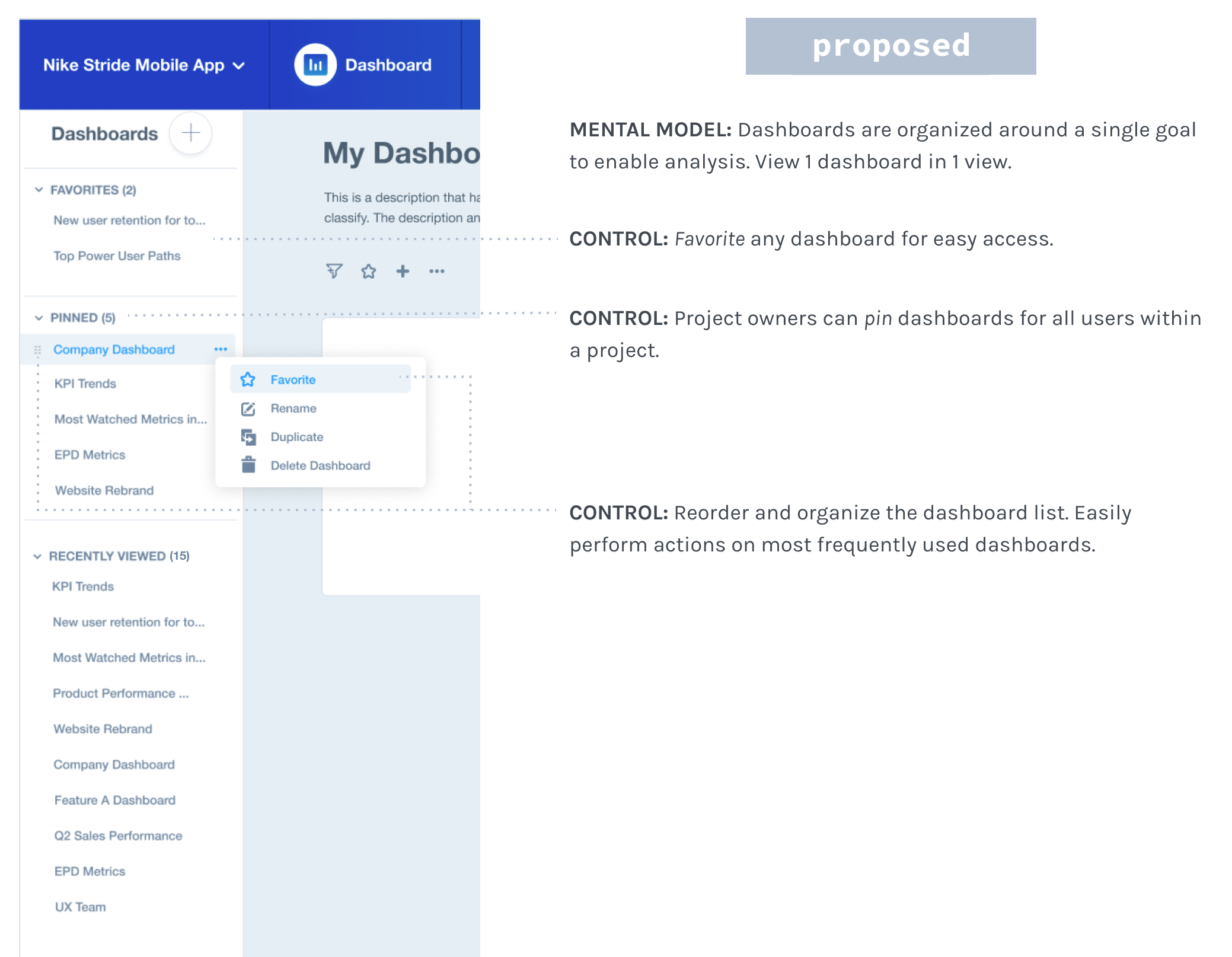
INTERFACE: Help users find relevant dashboards within a project easily:
Require all dashboards to have a name (diverges from existing untitled pattern that doesn’t work)
Optional descriptions that appear in dashboard lists
Hide private dashboards to keep the dashboard list clean
MENTAL MODEL: No more tag system! Now users can only see 1 dashboard in 1 view.
Solution 1.2) 🛠Build: Create From the Report View
WORKFLOW: Simplify the flow by removing tags & defaults
CONTROL: Remove defaults. Give users full control to add / create up front.
INTERFACE: Pull the “Create” CTA to the forefront so it’s an obvious action
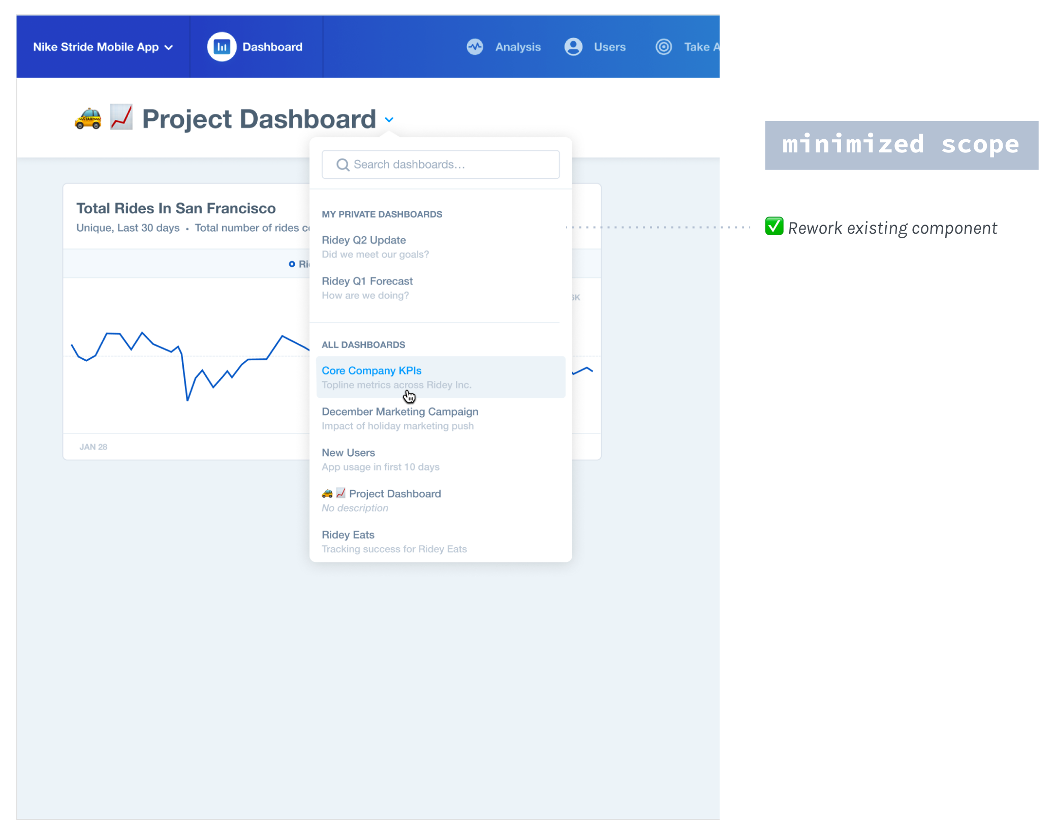
INTERFACE: Help users choose the right dashboard
Provide organization to dashboard lists. Stick more commonly used dashboards to top of list.
Provide context with dashboard descriptions
Solution 1.3) 🛠Build: Add/Remove Reports From the Dashboard View
This modal for loading any entity was componentized, which helped streamline our system that used various patterns.
WORKFLOW: Add reports directly from the dashboard view (vs 10 steps)!
WORKFLOW: Removing a report is one straight-forward action in the overflow menu of each report (vs being in two places & involving confusing tags).
INTERFACE: A timely confirmation toast helps users understand when reports have been successfully added.
Solution 1.4) 🛠Build: Add/Remove Reports From the Report View
CONTROL: Users have full control of which dashboard(s) to select.
MENTAL MODEL: A toast with a link to view the updated dashboard closes the gap in the flow, nudging users to continue setting up their dashboard view.
INTERFACE: The confirmation message is clear & timely, only appearing after something happens.
Solution 2) ⚙️Customize my dashboard so I can tell the best story with the data
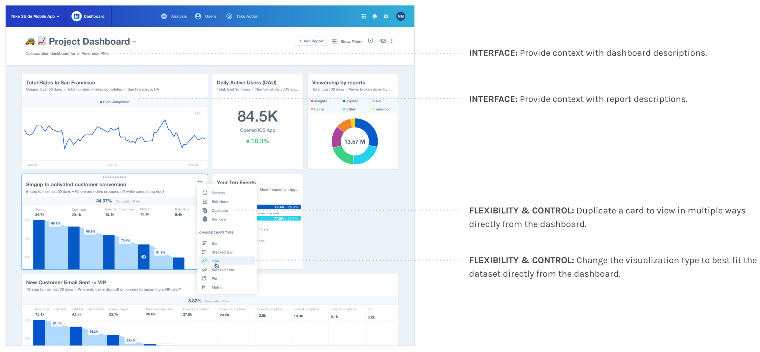
FLEXIBILITY: Resize cards (in expanding width Nx1-Nx4) to optimize the view that best fits their data.
CONTROL: Move cards anywhere to analyze related metrics
Solution 3) 🔍 Surface relevant dashboards so I can build off of existing work
Solution 4) 💡 Easily interpret the data so I can make quick decisions
FLEXIBILITY: Provide more visualization types & card sizes so users can optimize each report in the way that is easiest to interpret.
Final Bar, Pie, Metric & Funnel Charts:
Since funnels & pie visualizations would be used in the report views too, I worked with those teams to get them componentized. Rather than reinventing the visual style, I extended what existed. People ended up loving the smaller bar charts and found them even easier to read than the original!
Some deliverables for the bar & pie charts. Columns from L to R: what’s existing > new 1x1 version for normal screens > new 1x1 cards for smallest screens.
👀 Pssst: Mobile Dashboards! (Aside) I also did some iOS design work separate from this project. On the left are some more jams on the visualizations. Final designs are on the right.
Solution 5) 🗂 Filter the data so I can perform the right analysis to answer my question
FLEXIBILITY: Allow users to filter all reports globally from the dashboard. I worked with the Analysis team to redesign a scaleable filter dropdown that would work for any number & combination of filter types across reports.
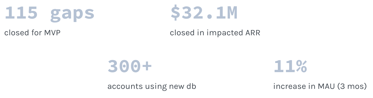
Step 5) Results & Takeaways
Overall this project was a success! We got great immediate adoption, but beyond our MVP, we continued iterating & gathering feedback. By the time I left, dashboards had become the 2nd most viewed report in all of Mixpanel (56% increase in MAU)!
Future Work: Feature Requests & Other Backlog Items
🌎 Shareable dashboards: Allow users to provide public access to a dashboard.
💾 Save filters: Allow users to save their dashboard filter selection.
🎯 Goal setting: Allow users to set goals on their dashboard metrics.
🎓 Onboarding dashboards: Teach new users about Mixpanel using dashboards.
Learnings
Keeping scope trim (MVP)
Designing for the future in an iterative development mindset
Staying scrappy with limited resources
Designing within a highly evolving product
Building trust with a new team